Thursday, 10 March 2011

Map Depositary Ideas

To start off designing the 'labyrinth' I split the site into a grid of 1400x1400mm - a size large enough for an A0 filing cabinet and room for structure around it. 


I wanted the labyrinth to feel random, not at all organised. To create a random layout, I started off simple... flipping two coins. Whichever side heads was on dictated whether the path went left or right. If the two coins ended up both heads, or neither heads, the path continued straight on. The path was 2800mm wide, i.e. wide enough for two map cabinets to be wheeled past each other.

This process was lengthy but created very random layouts. After browsing for a map, members of the public would meet a librarian at the lift and follow them into the labyrinth to collect their map. The void areas in the map would be reading rooms, where people could study the cartography.


To inspire the aesthetic, I watch the film 'Labyrinth' (1986). One thing I noticed was the use of brick throughout the entire labyrinth. This consistent use of the same material helps the monotonous feel, and the maze-like effect, helping the characters become lost inside. Another thing I noticed was the use of artificial lighting in the underground tunnels, providing (in this case) specific lighting for the film.


I did numerous lighting experiments, and settled on two final lighting strategies.


1) Lighting in sections, fitting in with the grid structure.


2) Lighting in the end of each corridor, above each corner.


I think both are successful, and could be used together. For instance, natural lighting via a light pipe above each corner in the labyrinth, and motion sensitive lighting meaning that once you head towards the end of the corridor, lights above guide you through. The monotonous approach means that at a subterranean crossroads each direction would look equally spooky.  


I also considered a completely brick structure, similar to underground wine cellars; but decided the steel structure helped dictate the grid layout. Wine cellars are a common form of underground storage and provided some interesting lighting studies, as did converted nuclear shelters and tunnels. Lighting in subterranean environments is extremely important, and there are a number of places to provide lighting:


Design - Initial Ideas

I wanted to design from the inside out. The librarian at Cambridge University Library informed me that the ideal map storage conditions would be in flat, horizontal trays. The environmental conditions would, ideally be between 16 and 19 degrees Celsius. 

I thought the best way of achieving suitable environmental conditions would be to build underground. A bore hole/ geology study showed that after a layer of topsoil, the ground is mainly clay underneath the site.


In section, I plan to have two buildings, either side of the solar panels. The brief stated two building functions - a public building for a map gallery/exhibition and browsing; and private areas for staff, cartographers and deliveries. I read this as two buildings, one either side of the solar panels on the north of the site. 


In plan, the two buildings would have stairs/lift access down to the subterranean levels, where the map storage would be organised in a maze-like grid. I like the idea of needing a map to find your way around a map depositary. 


In section along the corridor, the map storage could be built into the structure. The lighting could come from above and the map cabinets could be placed into purposely-sized vaults:


Isometric view of the parti diagram. My basic concept is two buildings connected by an underground network of map storage. 


Tuesday, 8 March 2011

Technology: Solar Studies

I used my sketchup model to create solar studies showing the site in different times of year: 


Typical Spring/Summer morning. The site is under minimal shade from the University Library on the east:

Typical Spring/Summer midday. The site is under no shade:

Typical Spring/Summer afternoon. The site is under from the slightest shade from the west:


Typical Autumn/Winter midday. The site is under minimal shading from the row of trees to the south:


Typical Autumn/Winter afternoon. The site is under shading from trees to the south and Robinson College from the east:


Typical Autumn/Winter morning. The five-storey library cast long shadows over the east of the site:


The diagram below shows the area of most solar gain in summer, highlighted in orange. The solar panels are located in the area of most solar gain to optimise electricity production for the library. The grey shows the areas of least solar gain:


The diagrams below, collected from the Met Office, show that the south-east and Cambridge gets more sunlight than the rest of the UK. The maximum temperature recorded in Cambridge was 36.5 degrees Celsius, so all of this heat would be felt on site.


Of Mapping

Brief: To Design a Map Library and Depository.


‘The Map Department in Cambridge contains some 1,000,000 maps, both British and foreign, several thousand atlases and other ancillary material. The average annual intake is about 30,000 items and over the years the accumulation of variant editions recording the changing landscape has become a particularly valuable feature of the collection. The Legal Deposit Libraries Act, which entitles the library to claim a copy of every new British publication, applies to maps as well as printed books.’ (Cambridge University)


The Site:

Located on a car park immediately west of Cambridge Library, where the current map department is cramped into one of the smaller wings, thus requiring a replacement, purpose-built map library and depository within the immediate context of the existing library.


On the very north extent of the site are four 'solar trees', solar panels, that require rights to light. They are 3m high, so need to be taken into consideration, i.e. I shouldn't design a two-storey building in front of them that would block out sunlight. They power 10% of the library's annual electricity needs.


View looking east towards the University Library:


View north looking onto the west of the site, onto the Cambridge Real Tennis club:


Saturday, 26 February 2011

The Hierarchy and Control of Knowledge

After my studies of the Library of Babel (http://alexwarrenarchitecture3.blogspot.com/) I watched 'The Name of The Rose', a film featuring a fictional library where books are controlled by the church. If the books contradicted the bible they were stored in a secret vault, a labyrinth, and were ultimately destroyed by the church to prevent people from ever reading the books.

This idea of control of knowledge, the hierarchy, appeals to me. The politics of know deserves to know what, and who decides who knows certain things is quite an interesting idea; and I have illustrated these ideas in a fictional reading environment of my own, as part of an intuitive response study.

If our knowledge is represented by a tower of books; where the taller your tower of books is, the more knowledge you have:


What is apparent is an instantaneous hierarchy of people who have different levels of knowledge. Do the heights of the towers, the amount of knowledge relate to intelligence? Not necessarily. Do they relate to a sense of hierarchy or self-superiority? They could do. 

Intellectuals and non-intellectuals are on towers of very differing heights. There is a sense of isolation between the two people. They find it hard to converse with each other, because of the height, because of the vast difference in knowledge. Perhaps those at the top do not care for the struggles of people below them; only concentrating on competing with those on similar towers. Who can build the tallest tower? Those on the tallest towers could even feel that their wealth of knowledge makes them an advanced, even an evolved lifeform of the people at the bottom. Knowledge is always evolving...


I used this idea of visual hierarchy to create the fictional reading environment below.


The books at the top of the image represent all the books being written, being published. Essentially all the material, whatever format, that could be read or absorbed. Below are all the readers, the people standing on their knowledge towers. In the centre of these towers stands the tallest tower - the person on top of it has more knowledge than everyone below them. They see all the books passing down to those below, so ultimately the person on the tallest tower has the power to stop distribution of certain books, to cut the strings, to dictate what others read. 

The idea that the dictators, the librarians, having the power to control knowledge is barely different to the monks controlling which books found their way into the bookshelves of the monastery in 'The Name of The Rose'. This is always how it has been... the people at the top control what people at the bottom have access to. This hierarchy of knowledge is a concept that I am interested in, and something I intend to challenge in my final design project this year. 

Monday, 7 February 2011

New Spatial Diagrams


Removing a few lines of text on a sheet, I have drawn new diagrams to describe the basic spatial layouts of my building:

Wednesday, 2 February 2011

Portfolio Review

For my portfolio review I have simplified my masterplan process into diagram form, removing a paragraph of text. This was not highlighted in my feedback but I felt it would improve my presentation:

The four diagrams represent the current site, new routes, radial piazza study and the 7 masterplan plots respectively.


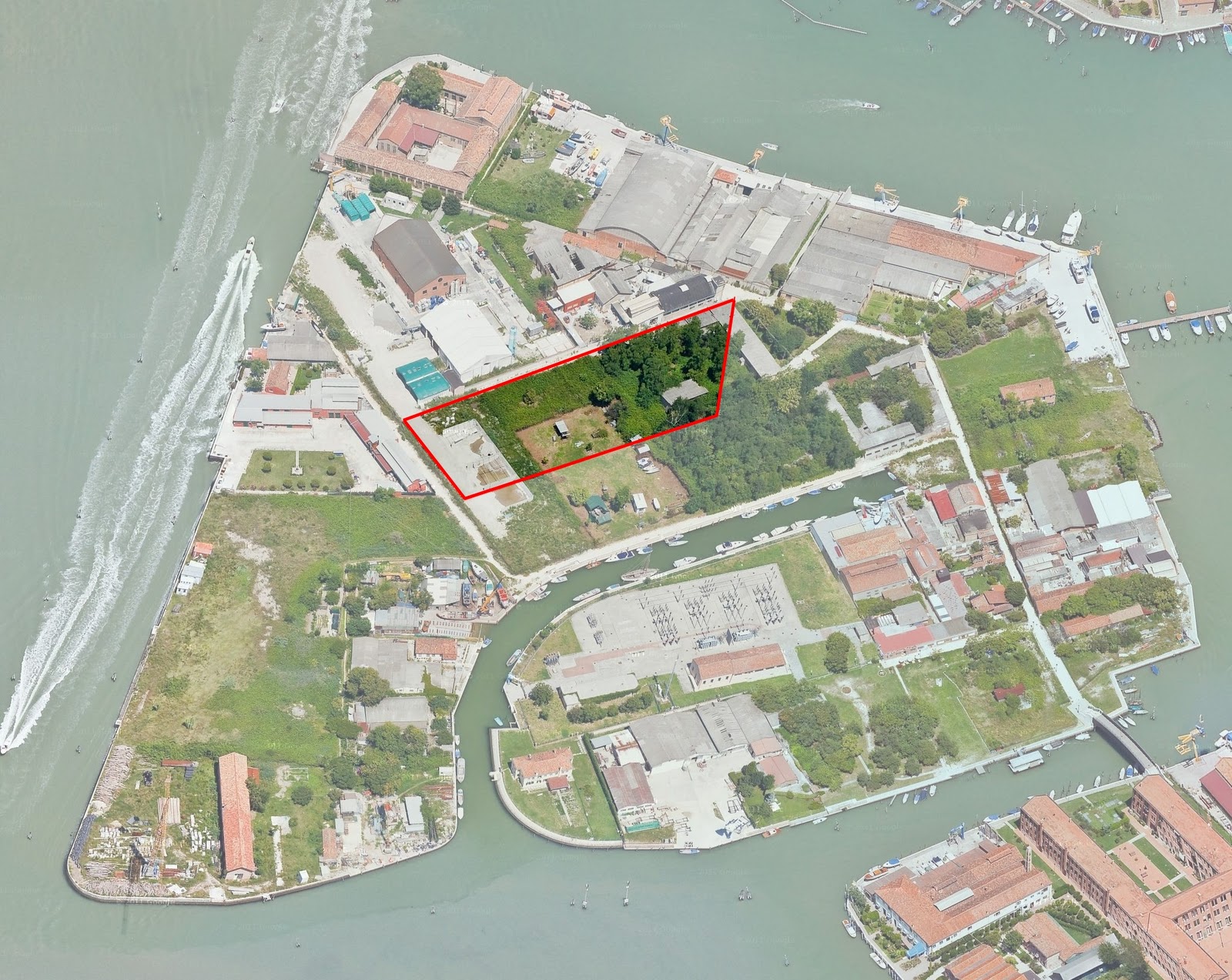
I also stitched together a number of images creating an aerial view of the island with my section of the masterplan, site A, highlighted in the centre:


I then took photographs of my 1:250 scale volumetric model within my masterplan in the wider context of Serenella. Disappointingly not all the masterplan blocks were present when I took the photos, but the 7 masterplan designs were all designed to line up with each other.


Referring to my feedback, I made diagrams showing the basic layout of my building, showing simply that I (in order) made the ground floor very public, stacked the services, and located waiting areas next door to therapy rooms so patients’ family/friends/carers would always be close by. 


I then built a makeshift photography studio in university (complete with hired lighting equipment) and used a combination of my dad’s old Pentax SLR film camera and my girlfriend’s Canon digital SLR to capture some photos of my 1:100 wooden model and my concrete volumetric model:


I had planned to construct my final model out of a solid block of concrete, but my volumetric experiment above taught me that there was just too much detail at 1:100 scale for this to be appropriate. The wooden model only took 2 days to build in the workshop, an experience I really enjoyed… it was a nice break from the computer screen.


Finally my feedback sheet reminded me that I needed to produce an image showing the view from the courtyard looking into the performance space. I also thought this was a good opportunity to show the closed façade at night when the building would not be open to the public:


I decided to heavily populate the daytime render with people facing away from the camera to make the focal point of my image be the performance space.

In the dusk render I added people walking through the site, but not directly engaging with the building; to show that the public would not use the building after dark. However I added a light in the staff training room above to hint that the staff would use the building in the evenings.

Both images are quite bright because the printers in the studio don’t really respond well to low lighting conditions – my first printing test resulted in a very black night image so I am trying to strike a balance between it looking good on screen and on paper.