Sunday, 8 May 2011

Final Review - Section

I've spent two days working on this section - the previous versions can be seen below. I have included more context to show how it relates to the neighbouring library, and have filled the whole base of the sheet with an underground texture (photo of concrete blended with earth, rock etc). This A0 sheet will be one of two sheets for my final presentation, and will be placed beneath the other - so the underground section is at the bottom of the board. 

Because space is short on the presentation boards, I have included my early underground storage studies (wind cellars etc) and initial ideas on the left, followed by my hand drawing (see previous blog entry) showing the two principal subterranean spaces; and finally the basement/depository floor plan. I have shaded in areas of dark and light on both the 1:100 section and the 1:200 basement plan to indicate where the light pipes are. 

(click to enlarge)


I like looking back at previous versions of this drawing from a few weeks ago. I've removed the pile foundations because I felt they were distracting, and have lightened the elevation of building two. The section cut line has been moved from the original section to include the study room.


Hand Drawing

To tie in with my early studies of fictional libraries, mythology, the control of knowledge etc I did not just want renders to illustrate my design. I have never been confident at hand drawing - I never know when to stop adding things to an image so usually end up ruining it. So, for this drawing showing the two main subterranean spaces, I scanned the drawing every ten minutes or so in case anything went wrong.

The first scanned image shows the two spaces - the study room on the left and the depository on the right. I have shaded the edges of the study room to indicate the shape of the room, and that the light does not penetrate into the corners.


I shaded in the depository in a similar way but added a beam of light underneath the light pipe to show the natural light in each corner of the labyrinth. The light should entice movement.


I penciled in the blockwork above the study room - these blocks emphasise the depth underground, making visitors feel they are deeper underground than they actually are, and hint that they are further from escape.


I spent a while drawing in bricks in the depository and rubbed out a white space between the two drawings to separate them. 


On Photoshop it was easy to tidy up the image. Adjusting the levels and the rotation made the drawing look better in seconds, and the inclusion of furniture and an oak floor made the space more believable. I looked at furniture designs by Niall McLaughlin and Charles Rennie Macintosh before designing my furniture - the aim, like the rest of the depository was to make the furniture look like it had been there for a number of years, but without making it seem antiquity.


 Mackintosh furniture designs: 


Friday, 6 May 2011

Exhibition Space

For the final review I wanted to introduce an idea of how the exhibition/gallery spaces would be inhabited.

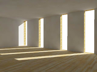
The spaces are simple - flexible and open plan. White polished plaster walls and oak floors. The maps could be hung on the walls or laid flat on tables (behind perspex/glass) in the centre of the small, 7m x 9.8m exhibition rooms.


Process

I rendered the view in v-ray. The light looks good here - the 3.8m vertical windows achieve long shadows across the room, encouraging people to wander across to them to experience the views.


I darkened the room slightly to draw more attention to the light patterns, added a sky behind the windows and hung up an old world map on the wall.


I then hung a few more maps up - the vertical windows allow a lot of wall space for displays. The library in the background has been coloured in and building 2 moved left to its correct position. The woman by the window is useful for scale.


Finally, I desaturated the image slightly because my final presentation sheets have a colour scheme of black, white, green, plus brick textures. I photoshopped in real trees to replace the sketchup trees to make the image more believable.


Sunday, 17 April 2011

Interim Review, 14th April

For this pin up I wanted to show the whole design process from the early library study to my current design. This meant producing a sheet with the early images from my Library of Babel case study, as well as the Intuitive Response to it. This was followed by an image showing the site and a few precedent studies, all of which have been written about in my earlier blog entries.

For this pin up I wanted to make the site clear - as I felt I have spent so much of my time on the building itself, the concepts of control, and how the interior spaces work. Up until a few days ago I had no good images showing how my design worked within the site. At first I produced the image below (which I printed at 1:200 scale), but felt it didn't really show much context, other than a few roads, the solar panels and the wall of the library to the east:


So I then drew this image, which printed at 1:500 scale shows a lot more of the surrounding context - the library, tennis club, college and school, as well as the trees, roads/access and the solar panels. The site plan shows the roof of the buildings and the labyrinth landscaping on the surface of the site:


Showing the building in section was also important, because it shows the link between my underground depository and the existing depository of the University Library. I could not find drawings/plans of the existing depository so had to guess the size - all I knew was that it was more than one basement floor and with it being a legal deposit library, the depository would be more or less the same size as the library above ground:


I then spent a great deal of time drawing up a larger, 1:100 section showing the depository in more detail. Unlike my previous section (see my older blog entries) which uses a skewed section line to cut through the two buildings above ground, I have used a straight section cut so that the section looks in to light catchers and a reading/study room below grade. It also shows an elevation of the private/staff building on the right. I chose to make the image black and white to tie in with my early concepts of mythology, labyrinths etc. Once this image was printed, I shaded in the subterranean rooms and corridors to show light/dark areas (below section):


Showing how the basement floor plan works with the ground floor plan is important to my scheme, so I created these two images (printed at 1:200) showing that the light pipes illuminate the corners, the twists/turns in the passageways below ground level.


 I thought the basement floor plan looked a bit dull though, so I experimented with making it look like an old map, something that could be found by a visitor once they arrive in the archives/the depository:


The coloured areas show different storage areas within the labyrinth, such as nautical maps, pre-1900 maps, modern maps, Charles Close Society maps/atlases precious maps etc. I printed this map on textured paper then had great fun tea-staining it to make it look like it had been in a depository for a few hundred years (the image above shows pre-staining). Unfortunately I don't think I will develop this idea because it does not tie in with my early concepts. Visitors are meant to be disorientated when they are inside, so giving them a map would ruin the experience. The map could be used by librarians, even if it is a static map underneath the private/staff building.


Showing how the spaces worked above ground was required so that the two towers didn't look arbitrary. The brick towers are supported by a concrete frame (I will blog details of this for my technical assignment later) and have a basic, but flexible floor layout for the cartography exhibition spaces. At the moment I have only had time to draw/render a basic room on Sketchup, showing windows/lighting but I plan to lose the rendering as this project progresses, making my images more hand drawn to tie in with early ideas of mythology, which I feel is being lost in shard CAD lines and renders:



The landscaping above ground is an important space. People will wander around this alien landscape with little idea of what lies beneath. Children from the neighbouring school should enjoy playing on the grass labyrinth. The space should be fun to explore for people of all ages. The western perimeter of the site is all paved - i.e. children playing will know not to leave the friendly, turfed area beyond the row of trees to the main road. The other sides of the site are much safer in comparison. I desaturated these images slightly so they worked better alongside my large black and white section. It felt uncomfortable having bright colours next to a moody greyscale image:


Feedback:

The main feedback was that I needed to show the spaces underground in more detail. I plan to have two large images showing the two main spaces underground - the corridor and the study room. The juxtaposition between these spaces will be interesting - the rough materiality and eerie lighting of the corridors and the bespoke, oak floored study rooms and the bright top lighting.

I was asked to look at Carlo Scarpa and Louis Kahn when designing the light catchers (my 2d section looked too diagrammatical) as their work was based on rough, but pure materiality. Niall McLaughlin was also mentioned - his monastery in London has very similar ideas to mine, and I might be able to get some ideas about furniture design from the architect too.

I need to design ceilings - I think I underestimated their importance in an underground building - but people would constantly look up, perhaps to seek a way out so these ceilings would always be in view. Designing doors is on my to-do list - heavy oak doors I think would meet my concepts.

I was also asked to make the basement floor plan more clear - the light pipes are drawn as squares when they would be circular and dotted lines in this floor plan. There would also be a perimeter on the plan showing the earth surrounding the building.

I need to create diagrams showing the relationship between the archivist and the visitor/researcher. Choreographing their movements through the subterranean space may create interesting diagrams. I might script this with sketchy, hand drawn images, perhaps a series of storyboards above the basement floor plan showing the movement.

Umberto Eco's book 'The Name of The Rose' was mentioned when I was talking about my early concepts, but I had watched the film in the first few weeks of this project, as it's controlling knowledge concepts were similar to those in Jorge Luis Borges' book 'The Library of Babel'.

Thursday, 14 April 2011

Construction & Structural Strategies

The structural strategy of the two towers is quite simple, 8 concrete columns are embedded in a brick cavity wall constructed tower at 4.9m intervals. A lift and fire stair take up 2.8m of the building (my whole building & site is still based on a 1400mm grid, based on the requirements of map storage). This is a structural system built into each tower. The private/staff tower has an identical structural strategy.


I have drawn a basic construction sequence. The existing earth on the site could be used to construct Cambridge's flood defenses up stream. Once the hole is dug, a retaining basement wall would be needed to stop earth falling into the site. The pile foundations and strip foundations supporting the depository's load-bearing brickwork walls would be built, followed by the basement level. The depository ceiling could then be made watertight as the concrete framework for the towers could be built on top. The two towers would be the last to finish construction:


I like to think that in hundreds of years time when the towers are disassembled, the depository/labyrinth will remain below ground for future generations to explore.

The facade would be constructed from local sandstone brick, much like the 3 surrounding buildings. This was an early idea of proportions, which are the same as one of the large light wells, as are the window openings in the tower - floor to ceiling 700mm x 3900mm openings set back to give the facade some depth.


Sunday, 10 April 2011

Environmental Strategies

I have had environmental considerations and strategies in my head with every design move I make. My early studies were an important part of the design process because they dictated the area where the light catchers could be placed to efficiently 'catch' light for the depository below. This diagram shows the areas of most (orange) and least (grey) solar gain, and I have used it to place all of my light catchers (small black squares):


The reading/study rooms however require more natural light so have a larger light void above them, which is capped with a glass ceiling. I have designed these light towers to be tall enough so that direct sunlight does not penetrate to the room below and damage precious material. The winter and summer sun angles are shown below:


Materiality experiments for the reading rooms. I want to create a subtle contrast to the eerie corridors leading up to the study rooms, by using bespoke furniture/decoration. The light void, at just over 2m wide should provide adequate natural light to illuminate the reading desk but controllable artificial lighting is also required in these spaces (winter afternoons for instance).


Wind.
I have placed the wind catchers at the south and west of the site to make best use of the prevailing winds from this direction, and the strong winds that blow down Grange Road:


Views looking south down Grange Road, where the main body of wind blows from:


I have explained my wind-catchers in more detail in other blog entries, but these diagrams show the basics. Cold, fresh air is sucked in using the natural stack effect, which ventilates the spaces underground, and warm, stale air is expelled on the north/east sides. I have designed the towers to be tall enough so that people walking past them do not experience the gusts of hot stale air - the vents are 3-4m above ground level.


I had an idea to use the main public/exhibition tower as a wind catcher too. Instead of the wind hitting the flat facade and creating gusty conditions for people at the bottom, the tower could have a built-in wind shaft that collects fresh air and feeds it into the plant room where it could be mechanically distributed for underground ventilation.


The floor plates of the tower are small enough (9.8m x 9.8m) that they can be naturally cross-ventilated. This keeps things simple in a small building:


Finally this section shows how my design fits in with existing mains water pipes running through the site. The ceiling of the depository is 2.8m below grade so this accommodates all the existing servicing pipes in the site... i.e. they do not need to be relocated.


Wednesday, 6 April 2011

Section 2


In this new section (click to enlarge) I am illustrating quite clearly the ground detail, as I feel it is so important to my scheme. The clay soil requires pile foundations to support the structure, which are connected to strip foundations running underneath the load bearing walls. I have run the section cut through the staircases rather than the lift core of the two towers to create more interest to the section, and have changed my design from a straight flight stair to a dog leg stair (to free up space), with a scissor stair in the public (left) building to control access into the depository below ground level.