
The four diagrams represent the current site, new routes, radial piazza study and the 7 masterplan plots respectively.

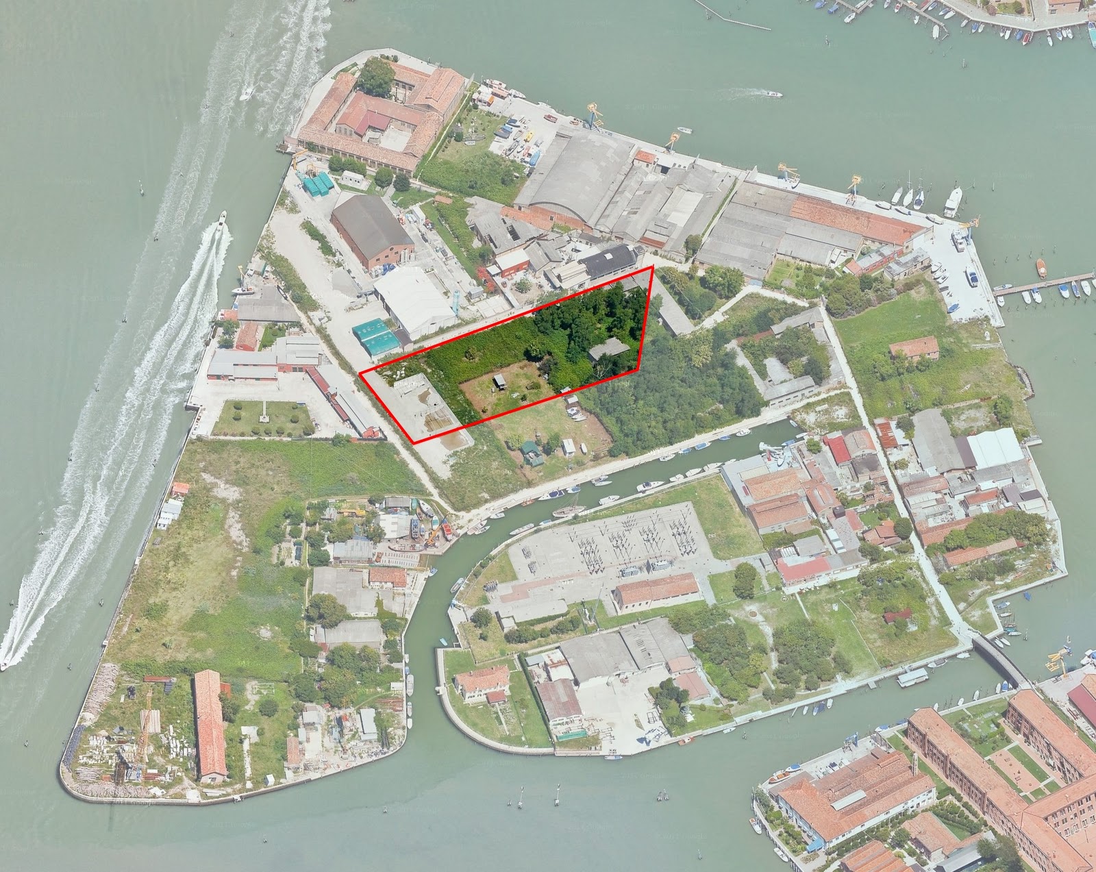
I also stitched together a number of images creating an aerial view of the island with my section of the masterplan, site A, highlighted in the centre:
I then took photographs of my 1:250 scale volumetric model within my masterplan in the wider context of Serenella. Disappointingly not all the masterplan blocks were present when I took the photos, but the 7 masterplan designs were all designed to line up with each other.

Referring to my feedback, I made diagrams showing the basic layout of my building, showing simply that I (in order) made the ground floor very public, stacked the services, and located waiting areas next door to therapy rooms so patients’ family/friends/carers would always be close by.

I then built a makeshift photography studio in university (complete with hired lighting equipment) and used a combination of my dad’s old Pentax SLR film camera and my girlfriend’s Canon digital SLR to capture some photos of my 1:100 wooden model and my concrete volumetric model:


I had planned to construct my final model out of a solid block of concrete, but my volumetric experiment above taught me that there was just too much detail at 1:100 scale for this to be appropriate. The wooden model only took 2 days to build in the workshop, an experience I really enjoyed… it was a nice break from the computer screen.
Finally my feedback sheet reminded me that I needed to produce an image showing the view from the courtyard looking into the performance space. I also thought this was a good opportunity to show the closed façade at night when the building would not be open to the public:

I decided to heavily populate the daytime render with people facing away from the camera to make the focal point of my image be the performance space.
In the dusk render I added people walking through the site, but not directly engaging with the building; to show that the public would not use the building after dark. However I added a light in the staff training room above to hint that the staff would use the building in the evenings.
Both images are quite bright because the printers in the studio don’t really respond well to low lighting conditions – my first printing test resulted in a very black night image so I am trying to strike a balance between it looking good on screen and on paper.
Thank you for sharing Designing Buildings
ReplyDelete