Once I had divided the site up into 1400 squares I used AutoCAD and Photoshop to experiment with quick circulation patterns through the underground depository. Each 1400mm square would contain an A0 map storage unit, containing perhaps 1000 maps. I worked out I would need 550 square metres of map storage (not including circulation), which I feel my single subterranean level would accommodate for, being just over 1000 sq.m.
I didn't want any wasted space underground, and I wanted the site boundaries to be as simple as possible, i.e. a rectangular containing wall. I decided the pathways should be 2800mm wide, so two map storage units could be wheeled past one another, and people could pass each other even if the A0 drawers are opened. The voids in the labyrinth are reading/work rooms and a supervised reading room for photocopying/tracing precious maps. The largest room is an atlas room, for books on shelves rather than in drawers:
The more I used parameters in the design of the labyrinth, the more it started to look like a viable floor plan. The obvious parameter between the three designs below and the design above is that the labyrinth is narrower due to the tall buildings above ground overshadowing any light pipes to the north. This meant that all the corners of the labyrinth, i.e. all the places that needed light pipes/ventilation, had to be placed between the two buildings above ground. This had the added structural bonus that the foundation structure of the buildings either side didn't interfere with the labyrinth structure - the two elements are now separate.
As these designs developed, I realised I would need to move the underground rooms further south in the site, to receive the most solar gain. The diagram below indicates the area of most solar gain in orange, the ideal location from light pipes:
The AutoCAD image above shows the 1400mm grid carved out to form the route through the site, and the subterranean reading rooms. The circulation is more clear when the image is inverted, below:
I have shown the quickest route through the site in red. What I felt important was that the route between the two buildings was not a straight line. I wanted people to discover the spaces, to be confused and intrigued by them, much like cartographers and explorers have dealt with maps in the past.
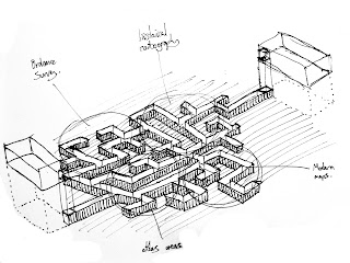
My sketch below (from a couple of weeks ago) shows that I plan to organise the labyrinth into different types of maps, for instance: Ordnance Surveys, Historical Cartography, Modern Maps and Atlases.
I like the idea of requiring a map to find your way around a map library, and I look forward to producing a map to guide visitors/external examiners through the building.


No comments:
Post a Comment