Thursday, 31 March 2011

Control & Ventilation

Controlling visitors to the maps depository is extremely important. Maps worth several thousand pounds cannot just be handled by anyone - currently the system is that maps are collected by librarians for members of the public to look at in a designated reading room. Maps are then placed under a layer of acetate to protect them. To implement this in section I am proposing two separate staircases within the same stairwell. One stair takes visitors up to the gallery/exhibition/browsing area on the 1st to 4th floors, whilst the other takes a researcher/someone who requires a map down to the depository accompanied by a librarian. 


This idea of control is an important concept. Whilst I am letting people into the map depository, I want people to experience the psychological feeling that they are under constant supervision, that everything they do is ultimately being controlled by a number of factors. After experiencing the disorientation of the labyrinth, the visitor is taken to a reading room where they will examine/trace/photocopy their selected map. Above them is a brick lightwell, 2800mm across, that lets natural light flood down into the reading room. The top of this lightwell is glazed - and this glass would be invisible from below. The visitor would see a small square of sky above them lined with brick. The experience would be like being inside a power plant's brick chimney looking up. The visitor would feel disconnected to the external environment, perhaps claustrophobic or a feeling that escape would be a challenge. This would also add to the protection of the map - the visitor would take more care over the map if they feel they are in an alien, uncontrollable environment. 


The lightwell is a different from the light-catcher, although the proportions/materiality are similar. The sunlight is reflected around the cylinder and lights up the area below, whilst the voids either side provide natural ventilation and the eerie noises that will make visitors feel even more uneasy.


Previous Design


The design of the 'light-catcher' (integrated light-pipe + wind-catcher) has evolved so that the ventilation openings at the top follow the same vertical principles of the rest of the design. The narrow openings may also help suck in wind more efficiently - smaller openings equate to more wind pressure. 


Current Design


Window Placement & Massing

I find Sketchup good for quickly creating window reveals to experiment with different elevation layouts. Because two sides of the tower are more or less windowless because of the services/core, the window placement looking over the new public space is visually important. The window sizes are all relative to the grid of the building, 1400 wide or 700 wide. All windows are floor to ceiling to emphasise the verticality of the tower... which sadly looks quite stumpy at the moment. I plan to rearrange the staircase from a single flight to a dog-leg stair to create more vertical space, improving the proportions of the building - ultimately making it more slender. The experiments below are in chronological order:


Too few windows

Windows too wide (1400)

Windows too controlled

Too many windows?


The interior of the tower will be white blockwork, keeping the monotonous, brick essence that I am trying so hard to convey in the rest of the design. The floor to ceiling windows will give people of all heights a good view out into the public space below:


 700mm openings


1400mm openings


The large openings on the top floor gallery offer the best views north out to the woodland and playing fields, and east towards the main university library - an important view as it gives visitors a visual link to the university library tower and across the site.

Model/Photography Experiments


I placed the main site model by a large window at university to let as much natural light onto the model as possible. The lighting conditions here represent the summer shadows at midday. No shadows are cast over the solar panels on the north of the site and light catchers and the two towers are positioned so they do not overshadow each other. Being able to move these models around has been very useful in experimenting with different ideas, different orientations, massings etc. The model may lack the accuracy of Sketchup but it is much quicker and more satisfying to experiment with different forms. 

I have also been using different photography angles, focusing and saturation to find the most interesting and intuitive angles of my building's basic massing. These experiments mean that, nearer my final presentation, I know the placement of the camera for the best understanding, and the best selling/promoting of the scheme.


Selective focusing:


By selectively focusing and angling photographs, it is possible to make my maps depository look minuscule compared to Cambridge's University Library. This highlights just how large the main library actually is - and my model has helped me understand this much better than Digimap images of the site.


De-saturation experiment:  


I'm really pleased with the desaturation experiment. The sharp and repetitive geometry of all the cuboid elements and the shading of the different planes is very apparent. The grey-scale image also adds to the psychological feel of my design - the controlling narrative of the repetitive elements and the lack of knowledge people have as they walk across the alien landscape without knowing about the subterranean labyrinth below. 

Saturday, 26 March 2011

Drawing Workshop

The aim of this workshop was to produce quick drawings showing our scheme, from parti diagrams to environmental sketches. I used onion-skin paper to capture the underground feel of my design. I enjoyed drawing on a large scale... I am used to using my sketchbook or tracing over existing drawings. It was interesting knowing how everyone's designs differed from mine. At the start of the project, we were all worried that because we were all designing a Map Library and Depository we would have very similar looking schemes... but it was refreshing to see so many different solutions to the same brief on a number of different sites.


Site Plan - Public Space sketches


Floor plan experiments

Underground Building Design (taken from my Books Blog)


Since I am designing a subterranean library in my design work, I felt it necessary to look at precedent studies of other libraries and similar buildings (archives/storage) that also sit underground. Subterranean library depositories are quite common, the book lists Harvard University Library (below), Minneapolis Public Library, Cornell University Library (New York, below), Michigan University Library (the book is American) and so on. The main book depository for Cambridge University neighbouring my site is also underground. I hope to create a tunnel/passage between my map depository and the existing book depository at the library. 


Nathan Marsh Pusey Library (Harvard), Massachusetts 


Cornell University Library, New York


There are immediate advantages and disadvantages to building underground, environmental, psychological and physiological. All three I feel are important to my scheme:

The main advantage seems to be minimal visible impact on site. Depositories are huge buildings, that would only be warehouses if built above ground. On a site next to a grade 1 listed building (Cambridge University Library) I wanted to minimise the impact. Another is that libraries are public buildings, therefore require public space around them. By building the majority of the structure underground, this will in theory create a large space above ground for the public. 

The environmental benefits are particularly important to my design, the main one being that it is easier to achieve climate controlled conditions underground. Energy use, reduced heat gain and heat loss due to the thermal massing of the ground surrounding the site, isolation from noise and vibration, fire protection, security and maintenance are all associated with being positive for a building underground. 


The psychological considerations, however, I find much more interesting. 

Lack of natural light, lack of views, claustrophobia and disorientation are the common arguments against building underground. But since my building is based on disorientating people, is based on labyrinths, on the exploration into the unknown (i.e. cartography, map making) then I do not see disorientation as a negative effect. In fact I see it as positive feature, adding to the exploration of the archives and my initial design concepts. 

Another thing I find interesting is the perceived psychological effects underground:

"Users of windowless or underground buildings often complain of poor temperature and humidity control and a lack of ventilation or stuffiness. Generally, none of the problems should be any different for a below-grade or windowless building than they are for a sealed, climate-controlled conventional building. Thus, in addition to the actual ventilation air change rate provided, perception of ventilation by occupants is important. If awareness of the superior internal environment control of an underground building is clearly apparent to the occupants, some offsetting positive attitudes may develop."

The corridors in my design are most closely associated with 'B: Atrium' below. The links to the surface, the light pipes and wind catchers may help reinforce this positive environmental viewpoint to users of the building.


The image below is the Civil and Mineral Engineering Building at the University of Minnesota, Minneapolis. Aside from being a beautifully detailed sectional perspective (something I plan to do at the end of this project) it seems like the most appropriate building use for a mainly subterranean building because of its purpose.


People tend to feel that underground building types are okay for certain uses, for instance an underground building would be unsuitable for perhaps an office or house, whereas storage, archives, even restaurants may be more suitable to be built below ground level. i.e. People need a good reason to go underground in the first place. 

People tend to fear going underground because they associate it with nuclear bunkers, with collapsing coal mines... undesirable places. So by clearly promoting the positive characteristics of subterranean design, I think I could help achieve the trust of potential users of the map depository.

Sunday, 20 March 2011

Understanding Subterranean Layout

The red squares indicate where the ventilation towers and light catchers are located - above the corners of the labyrinth. The idea behind this is that wherever you are you will see at least one beam of natural light to help influence subterranean circulation decisions. The slightly larger red squares are larger light pipes, perhaps glass roofed towers - I have not yet designed these. I have also shown the location of the two buildings above:


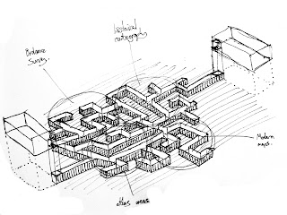
I also wanted to show how the maps and cartography material depository could be organised, so I have highlighted areas within the space that could be used for different purposes. (Click on images for 1:200 scale)


I wanted to keep the precious maps as close to the staff building as possible, as not members of the public would be allowed access into this room (this is the current situation). I chose to have frequent work rooms, one of which is a supervised room, and the smaller two are work rooms for perhaps one or two staff members at a time. All work rooms are naturally top lit, and would feature spacious reading/working desks as well as photocopying/tracing facilities.

The modern maps would be most sought-after so they are located nearest to the public building (west of the site); whereas the historic maps are located deeper into the labyrinth nearer the staff research area (east of the site). The atlas room is located within the Charles Close Society archives, which specialise in Ordnance Survey maps, which require bookshelves rather than large map drawers, although maps drawers can also accommodate books and small maps.


Saturday, 19 March 2011

Evolution of Cambridge

Cambridge, like so many towns and cities in the UK has evolved around water. The River Cam has been the spine of the city for over 1000 years.


 Red area indicates University Library and my neighbouring site.I learnt that my site is within the heritage/protected area of Cambridge (green areas, below) so my design would need to meet a number of criteria before it could be built... the legislation mainly listed materiality. Locally sourced, vernacular materials are important to new buildings in Cambridge. Modern buildings have the same material palette as buildings 100 years old but are buit in a much more contemporary way.


The material palette of Cambridge is mainly brick (various/red & dutch), stone (mainly limestone), timber (I noticed oak, birch and cedar when I was walking around Cambridge) and concrete (internal and external).

I found the nearest brick quarry, in Barrington, about 10 miles from the site:


... and the nearest timber merchants, which use timber from sustainably sourced forests just west of London. They specialise in Beech, Holly, Hornbeam and Oak.


Friday, 18 March 2011

Section and Volumetric Models

In section, the depository is 2800mm below ground, which ties in with the 1400mm grid. On the far left is the public building. The floor plates are small, 9.8m x 9.8m, so I propose one purpose per floor. 


Public Building (left):

Fourth Floor - Plant Room/Rainwater Recycling
Third Floor - Computer Area/Printing
Second Floor - Exhibition/Gallery
First Floor - Exhibition/Gallery
Ground floor - Reception, small shop and WCs.


Private/Staff Building (right):

Fourth Floor - Plant Room/Rainwater Recycling
Third Floor - Staff/Seminar Room
Second Floor - Digitalisation
First Floor - Workshop
Ground floor - Deliveries


The structures in between are the light wells and the ventilation towers. The larger towers are those above the underground reading rooms. 


I have shown the above ground structures on my 1:250 wooden model. I wanted to push the public building right up against the edge of the pavement, to maximise the number of people walking past it.


The building turns its back on the primary school to the south and the college to the west. However I want it to open up onto the new public space I am creating above the labyrinth:


I have shown below how people can inhabit this space. The 1.4 x 1.4 x 4.2m horizontal blocks are the same proportions as the neighbouring wind catchers; they aren't too tall to climb on. It would be interesting having the primary school using the space as a playground, and ultimately an interesting walk to work for the staff in the east building.


Labyrinth Development

Once I had divided the site up into 1400 squares I used AutoCAD and Photoshop to experiment with quick circulation patterns through the underground depository. Each 1400mm square would contain an A0 map storage unit, containing perhaps 1000 maps. I worked out I would need 550 square metres of map storage (not including circulation), which I feel my single subterranean level would accommodate for, being just over 1000 sq.m. 

I didn't want any wasted space underground, and I wanted the site boundaries to be as simple as possible, i.e. a rectangular containing wall. I decided the pathways should be 2800mm wide, so two map storage units could be wheeled past one another, and people could pass each other even if the A0 drawers are opened. The voids in the labyrinth are reading/work rooms and a supervised reading room for photocopying/tracing precious maps. The largest room is an atlas room, for books on shelves rather than in drawers:


The more I used parameters in the design of the labyrinth, the more it started to look like a viable floor plan. The obvious parameter between the three designs below and the design above is that the labyrinth is narrower due to the tall buildings above ground overshadowing any light pipes to the north. This meant that all the corners of the labyrinth, i.e. all the places that needed light pipes/ventilation, had to be placed between the two buildings above ground. This had the added structural bonus that the foundation structure of the buildings either side didn't interfere with the labyrinth structure - the two elements are now separate.


As these designs developed, I realised I would need to move the underground rooms further south in the site, to receive the most solar gain. The diagram below indicates the area of most solar gain in orange, the ideal location from light pipes:


The AutoCAD image above shows the 1400mm grid carved out to form the route through the site, and the subterranean reading rooms. The circulation is more clear when the image is inverted, below:


I have shown the quickest route through the site in red. What I felt important was that the route between the two buildings was not a straight line. I wanted people to discover the spaces, to be confused and intrigued by them, much like cartographers and explorers have dealt with maps in the past. 


My sketch below (from a couple of weeks ago) shows that I plan to organise the labyrinth into different types of maps, for instance: Ordnance Surveys, Historical Cartography, Modern Maps and Atlases. 


I like the idea of requiring a map to find your way around a map library, and I look forward to producing a map to guide visitors/external examiners through the building.